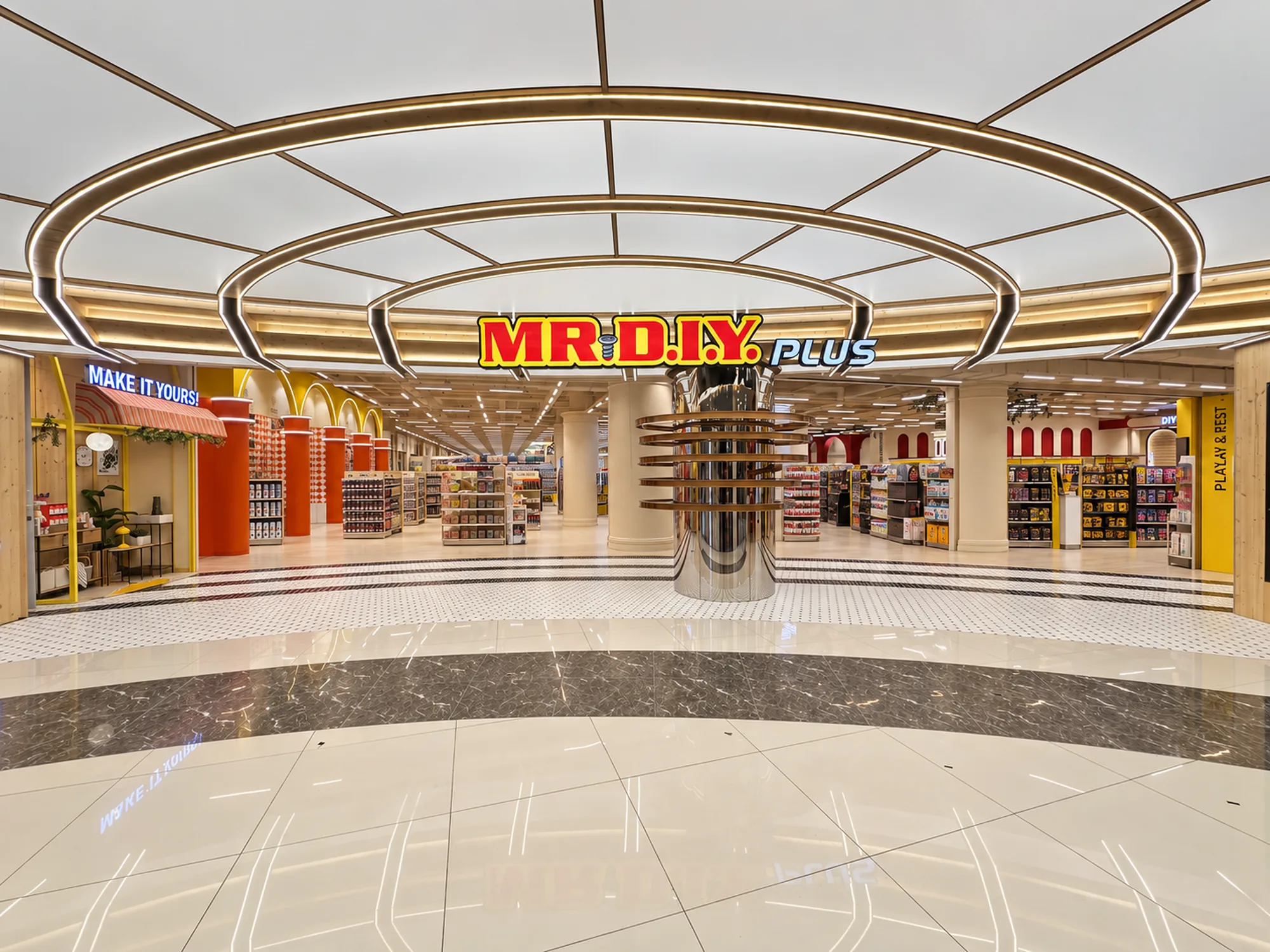
The flagship that had to teach a whole format how to behave
MR D.I.Y Plus · Lot 1-46, The Mines Shopping Mall, Mines Wellness City, Seri Kembangan, Selangor
The challenge
MR D.I.Y is one of Asia's fastest-growing value retailers. The Plus format is its most ambitious: a single store that has to hold hardware, homeware, toys, stationery, beauty and a workshop — six shopping missions with almost nothing in common.
The Mines was to be the flagship. Roughly 30,000 square feet on one level, a wide mall frontage, and a brief that pulled hard in two directions at once. It had to feel like a destination worth travelling for. It also had to remain unmistakably a value retailer, where nothing on the shopfloor suggests the prices have gone up.
Three constraints shaped everything that followed:
- One roof, six behaviours. A customer buying a screwdriver and a customer buying a plush toy move at completely different speeds. Put them in the same aisle rhythm and both are badly served.
- It had to be repeatable. A flagship that cannot be decoded by the next contractor in the next state is a one-off, not a format. Every decision had to survive being handed to a team who were never in the room.
- Display density could not drop. Feature moments consume floor area. In value retail, floor area is inventory, and inventory is revenue. Any square foot spent on experience had to be argued for.
A flagship is not a store with a bigger budget. It is the store that has to explain the format to everyone who builds the next twenty.
The strategy
Stop treating it as one store. Design it as a high street — a main run with distinct shopfronts opening off it, each with its own identity, all under one tenancy.
The high-street model solved the six-behaviours problem without fragmenting the plan. A single primary circulation spine carries the customer from the entrance to the back of the store. The sub-brands sit off it as rooms with their own thresholds, ceilings and colour. You do not need signage to know you have walked into the toy zone; the architecture tells you.
It also solved the density problem. Because identity is carried by ceilings, thresholds and graphics — surfaces above and around the fixtures rather than instead of them — the experience budget mostly spends height, not floor. Gondola runs stay uninterrupted. The display ratio holds.
The one number we set first. Before a single line was drawn we fixed the display ratio — total display area against gross floor area — so every later idea could be tested against it rather than argued about on taste. Read the method →
Customer journey
Eight moments, in the order a customer meets them. Select a zone to see what it is doing and why it sits where it does.
Mood
Warm, bright and unembarrassed. The reference was a covered market, not a department store.
Value retail has a default look — white grid ceiling, cool fluorescent light, primary graphics, everything shouting at once. It is efficient and it is exhausting, and it makes a thirty-thousand-square-foot store feel like a warehouse the moment the novelty wears off.
We took the temperature up and the noise down. Cream and natural pinewood carry the base condition throughout. Colour is concentrated: it belongs to the zones, and the zones earn it. Between them, the palette resets to neutral so that arriving somewhere new actually registers.
The arched motif runs through the store as the connective device — in the display wall, the colonnade, the thresholds and the ceiling rings. It is a soft, generous, market-hall geometry, and it does a specific job: it makes a very large room feel like it was composed rather than merely filled.


Lighting philosophy
Light the product, not the floor. Almost every retail lighting failure we are called in to fix is the same mistake in a different building.
The instinct is to light a store evenly from above, which produces a bright floor, a well-lit customer, and merchandise sitting in its own shadow. We prioritise vertical illuminance — light landing on the face of the product, where the decision actually gets made.
Three layers do the work here:
- Ambient. A calm, even base across the sales floor. Enough to move safely and read the store; deliberately not the hero.
- Vertical. Continuous linear light washing gondola faces and perimeter runs, so product reads from the far end of an aisle.
- Feature. Concealed LED in ceiling rings, arch profiles and thresholds. This layer carries the identity and marks the zones. It is drawn as a dedicated layer in the set so it survives value engineering as a visible line item rather than quietly disappearing.
Contrast between those layers is what makes a feature read as a feature. Raise the ambient and the whole composition flattens.
Materials
A short palette, specified to survive a decade of trolleys.
Every material in a value-retail store is a maintenance decision disguised as an aesthetic one. The palette was kept deliberately short so that replacement stock is easy to hold, and so that a repair in year four does not read as a patch.
| Element | Specification | Why |
|---|---|---|
| Shopfront band & ceiling | Natural pinewood finish | Warmth against a cool mall concourse; ages honestly rather than chipping. |
| Bulkheads & arches | Plywood, spray paint finish | Curved geometry at a sane cost; consistent radius across many bays. |
| Shopfront framing | Aluminium, bronze / chrome powder coat | Thin sightlines at height, no on-site corrosion risk. |
| Feature backing | Stainless steel, mirror finish | Doubles perceived depth behind the display wall and bounces feature light. |
| Suspension | Stainless steel wire rope | Visually near-invisible; keeps the awning line clean at 3,460 mm. |
| Signage | 100 mm 3D wordmark, 600 mm high | Legible the full length of the concourse without over-scaling the frontage. |
| Feature ring | 2,600 mm Ø LED band, steel backing | Holds true circular geometry over a long span; no sag over time. |
Extracted from the issued construction set, sheet P-11 R1 and associated shopfront details.
Store planning
One spine, two cross-runs, no dead ends.
The plan is disciplined to the point of being boring, which is the point. A single primary spine runs front to back. Two cross-runs connect it to the perimeter. Every zone touches the spine or a cross-run, so no customer is ever more than one turn from the main route, and no corner of the store can quietly die.
Fixture heights step down toward the centre of the floor. Perimeter runs are tall — they carry density and enclose the room. Mid-floor gondolas are lower so that sightlines across the store stay open and the ceiling features stay visible from wherever you are standing. That single rule is what stops a 30,000 sq ft floor from becoming a maze.
Underneath all of it sits a fixed studio module standard — a single set of bay widths, height bands, depths and shelf pitches shared across our CAD blocks, our 3D library and the costing model. It is the reason a store in the programme can be documented quickly and priced accurately, and the reason the drawings for one store are usable in the next. We develop and maintain that standard with each client as part of the engagement.
Visual merchandising
The store has to still look designed after the shop team has filled it.
This is where most retail design quietly fails. A scheme is photographed on handover day and never looks that way again, because the merchandising system was never designed — only the architecture was.
So the visual merchandising language was drawn as part of the set, not left to site:
- A fixed graphic hierarchy. Zone identity, category sign, promotional call-out and price ticket each have a defined size, height and material. A new promotion slots into an existing tier instead of inventing a new one.
- Designated hero positions. Feature ends, stage and threshold displays are drawn as specific locations with specific dimensions. The team knows exactly where the store is allowed to shout.
- Protected sightlines. Certain views — entrance to stage, spine to workshop — are marked as no-build zones. Nothing temporary is permitted to close them.
Design the messy state, not the photograph. The messy state is the one customers actually see.
Fixture system
A kit of parts, not a catalogue of one-offs.
Every fixture in the store resolves to a small family of components built on the same 45 mm upright and 300 mm shelf pitch. Zones differ by end panel, colour, graphic and lighting — not by structure. A toy bay and a hardware bay are the same chassis wearing different clothes.
The commercial argument for this is straightforward: one fabricator can quote the whole store from a single set of typical details, quantities consolidate across zones, and the next store in the programme reorders rather than redesigns. The design argument is better — a consistent chassis is what lets the feature moments read as deliberate, because everything around them is quiet.


Construction details
130 sheets, issued as one navigable set.
A flagship lives or dies on the quality of its documentation. The Mines was issued as a 130-sheet ID construction set with a maintained drawing register — general arrangement, reflected ceiling plans, elevations, shopfront details, fixture typicals, signage, electrical and LED layouts, cashier numbering, price-checker details and finishes schedules.
Two conventions that we hold to on every set, and that mattered here:
- LED runs are drawn magenta on their own layer. Concealed lighting is the first thing lost in value engineering and the first thing a contractor omits by accident. Making it impossible to miss on the drawing is the cheapest protection available.
- The title block never overlaps the drawing. A detail obscured by a title block is a request for a site query, and a site query is a variation waiting to happen.
Drag the slider to compare the issued shopfront elevation against the completed frontage.


Final photography
Opening week, trading, full of people. We do not photograph empty stores — an empty store is a showroom, and a showroom proves nothing.


From MR D.I.Y.'s launch photography


Lessons learned
What we would tell the next client before they start.
- Fix the display ratio before the concept, not after. Every argument about whether a feature is affordable becomes a five-minute conversation once there is an agreed number. Without one, it is taste against taste.
- Zone identity belongs overhead. Ceilings, thresholds and graphics cost height, not floor. Identity built out of floor-standing elements is identity you will delete the first time a category needs more space.
- Draw the lighting layer separately and loudly. Concealed LED is the highest-impact, lowest-cost element in the scheme and the easiest to lose. Protect it on the drawing.
- A flagship is a prototype. Budget for the fact that you are debugging a format, not just building a store. The value of The Mines is not only the store — it is that the next twenty are faster, cheaper and more consistent because this one was documented properly.
- Photograph it full. Design for the store at its busiest and messiest. That is the only version the customer will ever meet.